To create a portfolio company’s chart, you must be a VC admin or VC member with access to the fund your company is assigned to, plus you’re subscribing to Rundit VC Pro or VC Pro+.
- Navigate to the top bar and click Companies -> select a company to open its profile.
- Choose the Dashboard tab. From there, you can create and see all charts of the chosen company. Please note that this tab is private and only visible to your VC team.

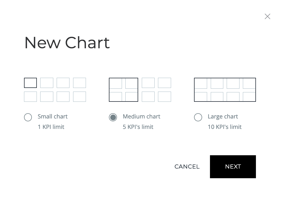
- Hit the button Add chart at the top right of your screen -> Choose chart size -> Click Next. Please note that each chart size will display a limited number of KPIs.
- Then, name your chart title and set the display periods to be month, quarter or year, together with the number of periods shown in the chart (the x-axis).
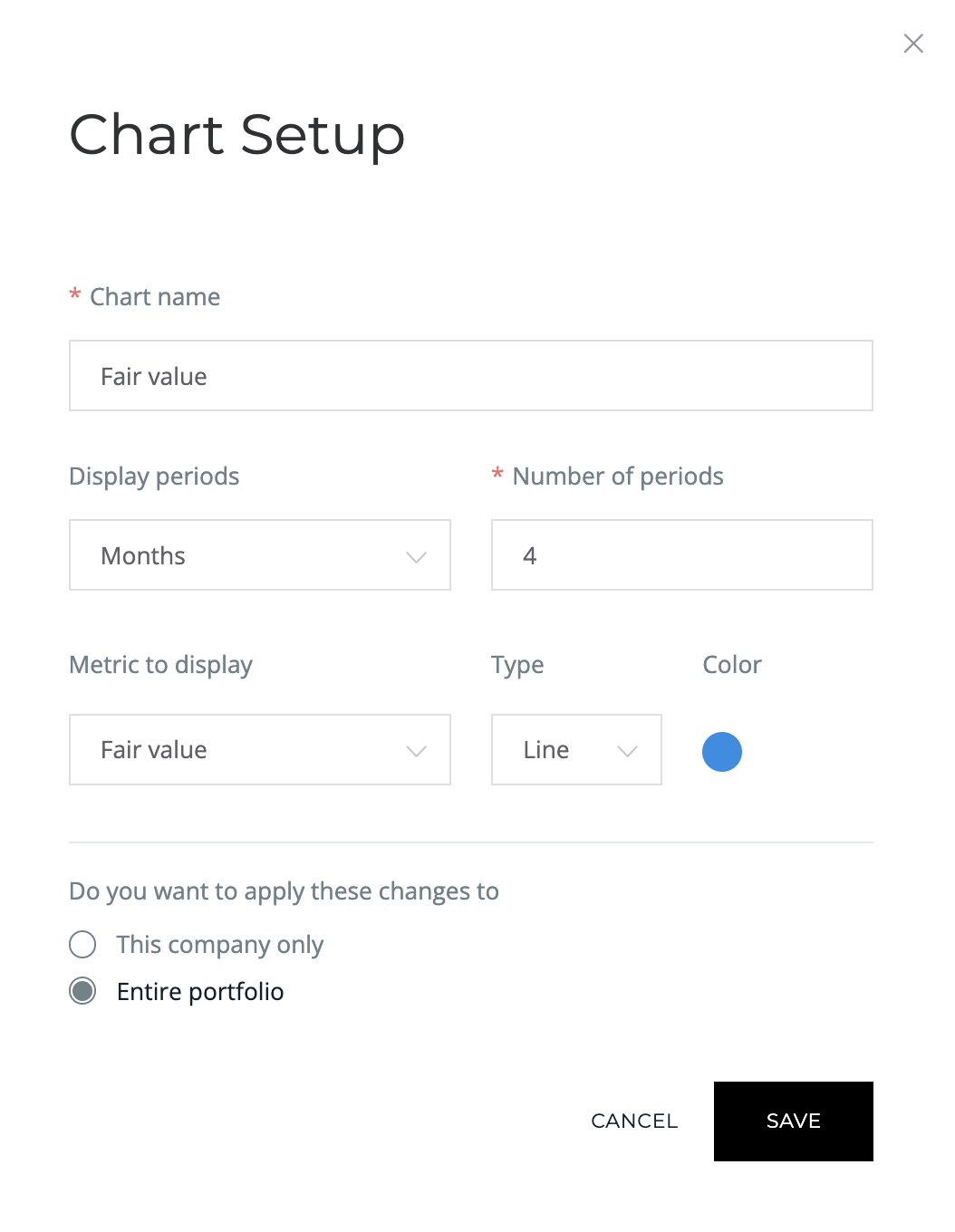
- Select metric(s) to show in your chart.
- Apply these changes to:
- This company only: If you want to add this chart to the dashboard of this company only, choose This company only. Your newly created chart will locate under the headline Charts for *Company name* in the Dashboard tab in this company profile.
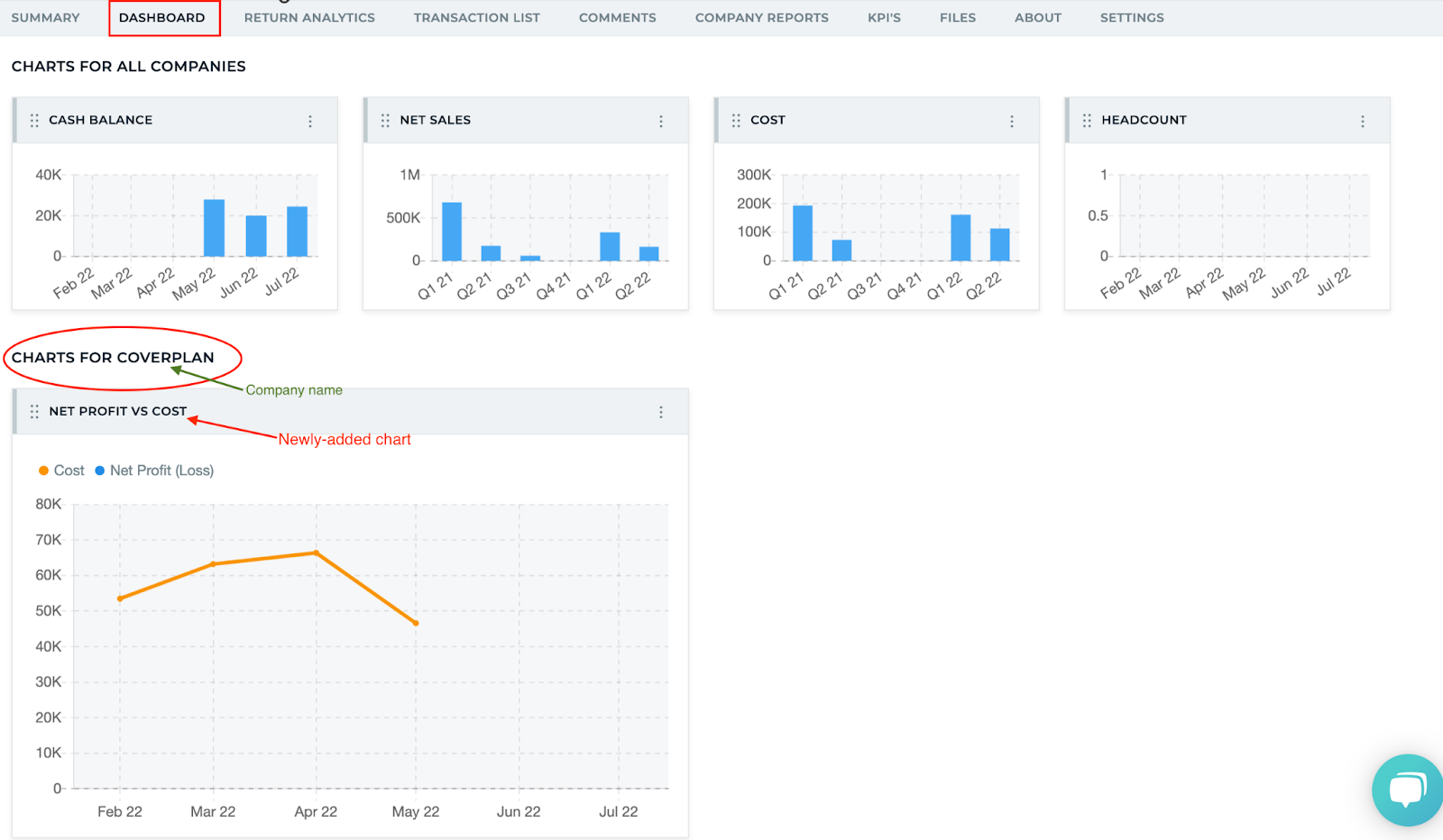
- Entire portfolio: If you want to add this chart to the Dashboard tab of the entire portfolio, choose Entire portfolio. Your newly created chart will locate under the headline Charts for all companies in the Dashboard tab in all company profiles.

- Finish this step by hitting Save.